CASE STUDY
Frozen Assets: Building the Arctiva Brand
CONTEXTArctiva was a new probiotic-enhanced skincare line built around Hydrosurf, a proprietary ingredient inspired by novel bacteria discovered in glacial lakes in Antarctica. As a new entrant in a crowded skincare category, the brand needed to quickly establish credibility, communicate a highly differentiated ingredient story, and create a visual identity that would stand out against more established competitors.
The challenge was to develop a consumer-facing brand system that could feel clean, credible, soothing, and distinctive while supporting a full product launch across packaging, ecommerce, Amazon, social media, sampling, and sales materials.
GOALCreate a launch-ready brand system for Arctiva that clearly positioned the product line in the medicated skincare market, elevated the Hydrosurf ingredient story, and provided the creative foundation needed to support packaging, digital commerce, marketing communications, and sales efforts.
MY ROLEI oversaw creative direction for the Arctiva brand launch, managed the external agency relationship, and led the in-house development of packaging, marketing collateral, ecommerce assets, Amazon content, sales materials, and launch support. My role included guiding the brand from initial identity development through execution across consumer, retail, and digital touchpoints.
APPROACHThe project began with discovery, market research, and collaboration with an external agency to establish the foundation of the Arctiva brand. I managed the agency relationship and worked closely with their team to refine the logo, typography, color palette, and initial visual guidelines. Once the core identity was approved, continued development of the brand was brought in-house.
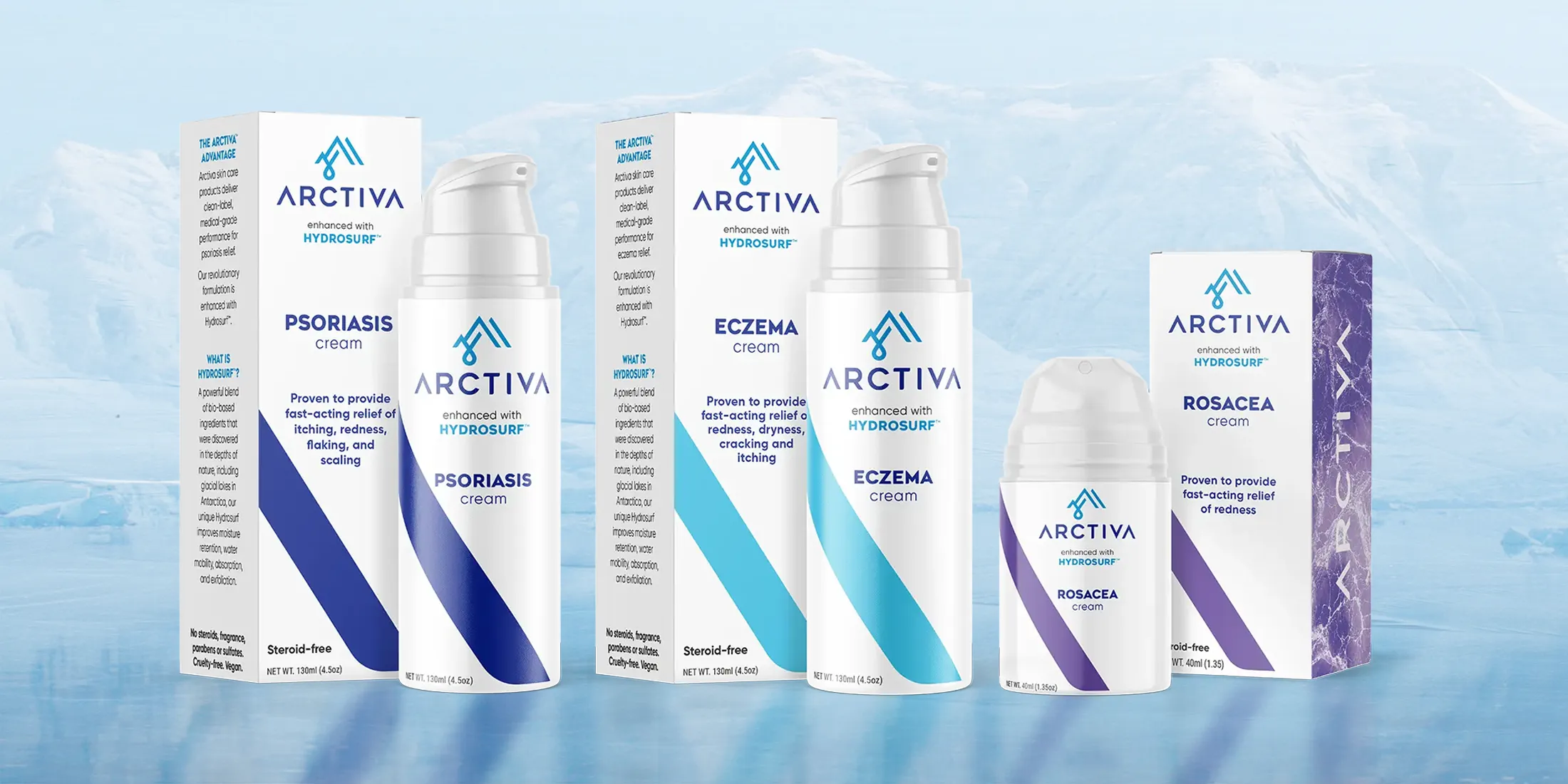
From there, the internal creative team expanded the brand into a complete launch system. Packaging went through multiple rounds of exploration and refinement before landing on a clean, restrained design approach that reinforced the products’ soothing properties and simple formulations. A glacial color palette helped differentiate products within the line while maintaining a cohesive brand presence across the full system.
The broader visual language used imagery and design elements inspired by glaciers, ice, and snow to connect the brand back to Antarctica while suggesting a cooling, calming effect for irritated, itchy, and uncomfortable skin. This system was then applied across marketing collateral, product photography, ecommerce assets, Amazon A+ content, sampling materials, and social media planning.
The final launch platform gave Arctiva a distinctive consumer brand presence, a clear product story, and a flexible visual system that could scale across multiple channels.
OUTCOMEArctiva launched with a cohesive brand identity, a complete packaging system, ecommerce presence, Amazon content, product photography, marketing collateral, sampling support, and social media assets. The work helped transform a novel ingredient and product concept into a polished consumer brand with a clear market position and a strong foundation for continued growth.
The creative team really excelled in crafting the Arctiva brand system. They translated our vision into a distinctive identity, effectively calling out the products’ unique benefits and properties. Their work not only differentiates Arctiva but also resonates deeply with consumers, setting us apart in a competitive market.
Vic Peroni
COO, Arctiva Wellness
Credits
Tessa Gilliland
Michael Ebner
Hawke Media