CASE STUDY
Unifying a Multi-Industry Brand System
CONTEXTLocus Fermentation Solutions operated six business divisions developing proprietary bio-based technologies for industries including energy, agriculture, mining, ingredients, animal nutrition, and consumer products. Reflecting the company's original business strategy, each division had been branded separately, with its own visual and verbal identity.
As the company evolved, that fragmented approach became increasingly difficult to manage. The separate brands created confusion internally and externally, weakened the perception of Locus as a unified organization, and made it harder to communicate the company's full capabilities with clarity and consistency.
GOALCreate a unified brand identity that brought the corporate brand and six business divisions together while allowing each to maintain its distinct market focus. Establish a flexible, consistent system that could be applied across the organization and support future growth.
MY ROLEAs Creative Director, I reported directly to the CEO and led the creative direction of the rebrand, from establishing the overall visual approach to overseeing its implementation across the organization.
I directed a three-person creative team, assigning responsibilities based on individual strengths, guiding creative development, reviewing work, and maintaining final approval of the team's output. While I established the overall creative vision and developed key brand elements, my team handled much of the execution.
The initial six-month effort expanded into a year-long implementation involving multiple business divisions, senior leadership, and a wide range of brand applications.
APPROACHWe began by interviewing colleagues across the company to understand how the Locus brand was perceived internally, then spoke with customers and vendors to understand how it was experienced externally.
Those insights informed a creative direction that would establish Locus as one recognizable organization without losing the distinct needs of its business divisions.
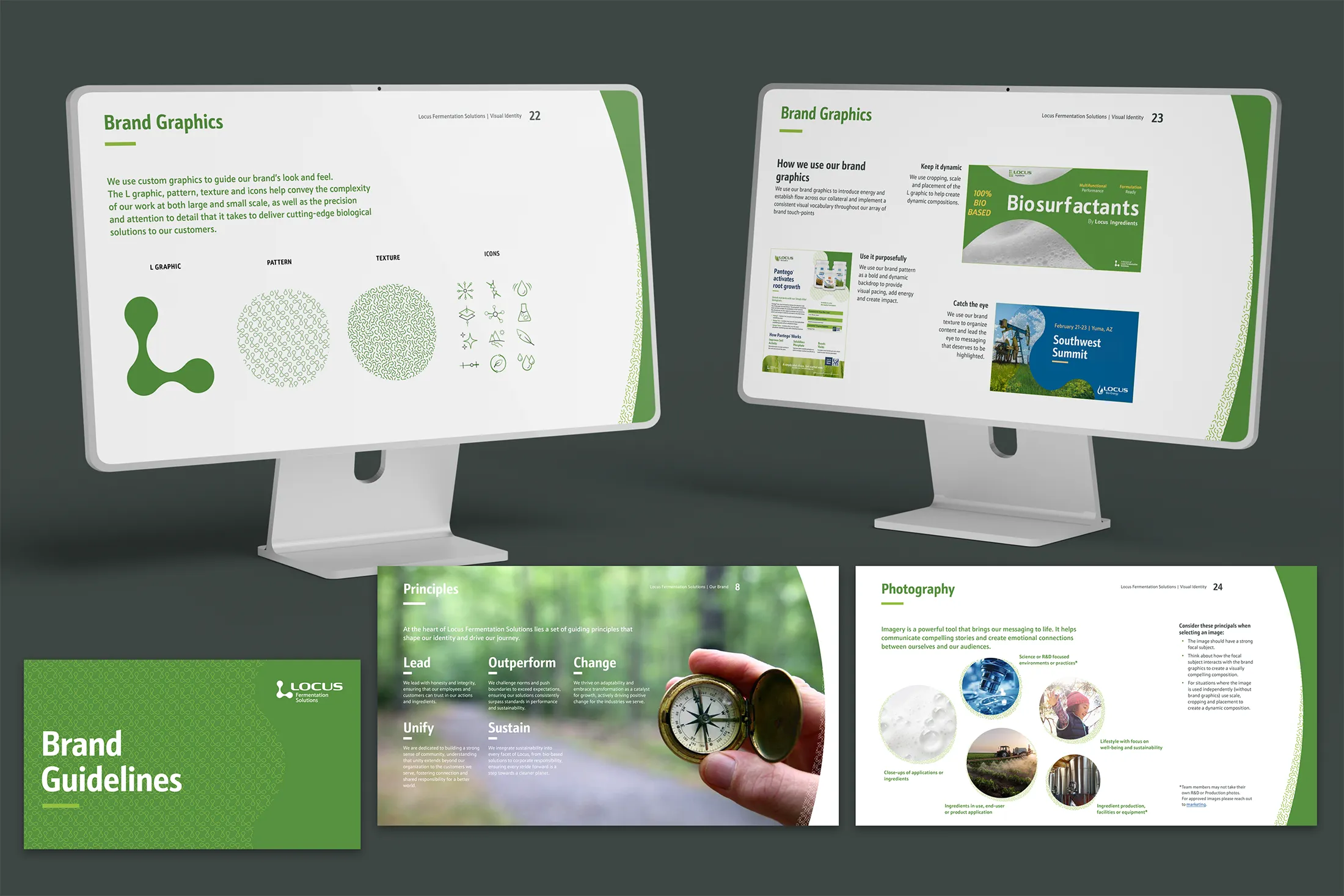
I guided the team through the development of a redesigned corporate identity and a related family of business division logos. We then used the strongest element of the new Locus logo, the Locus “L,” as the foundation for a broader visual system. Its dramatic curves became a recognizable graphic device that could bring consistency and flexibility to layouts across print, digital, environmental, and presentation applications.
Working collaboratively, we also developed the company's verbal identity, including its mission, vision, tagline, and values. Typography, color palettes, graphic elements, layout principles, and usage rules were documented in comprehensive brand guidelines.
Throughout the process, I worked with marketing and executive leadership to align priorities, evaluate creative decisions, and address the needs of individual business divisions while protecting the integrity of the new brand.
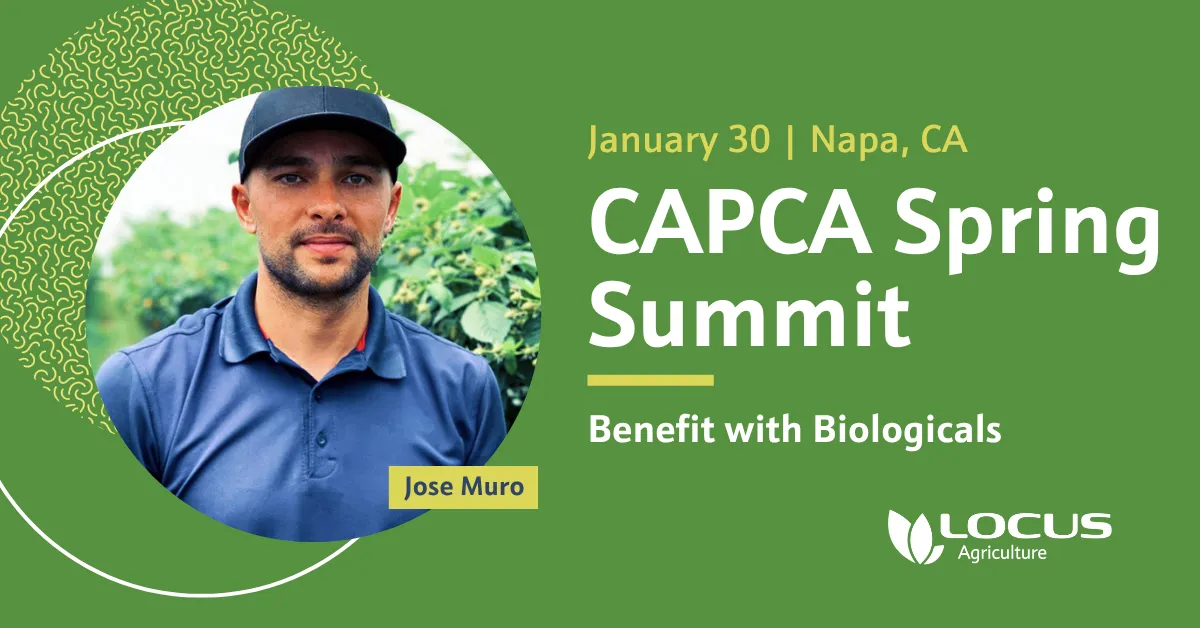
As implementation expanded, I also strengthened the creative department's operations, introducing regular team check-ins and a centralized digital asset management system. These changes helped the team collaborate more effectively, manage a growing volume of work, and maintain consistency as the new identity was applied across websites, marketing materials, presentations, social media, and environmental graphics.
OUTCOMEThe rebrand replaced a fragmented collection of identities with a cohesive visual and verbal system connecting the corporate brand and its six business divisions.
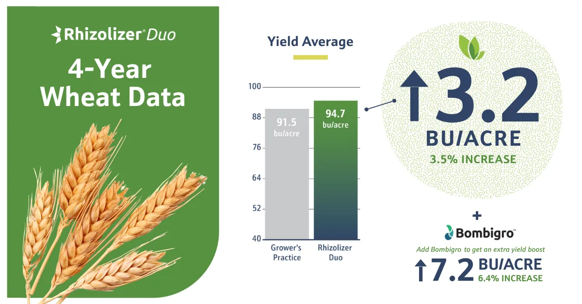
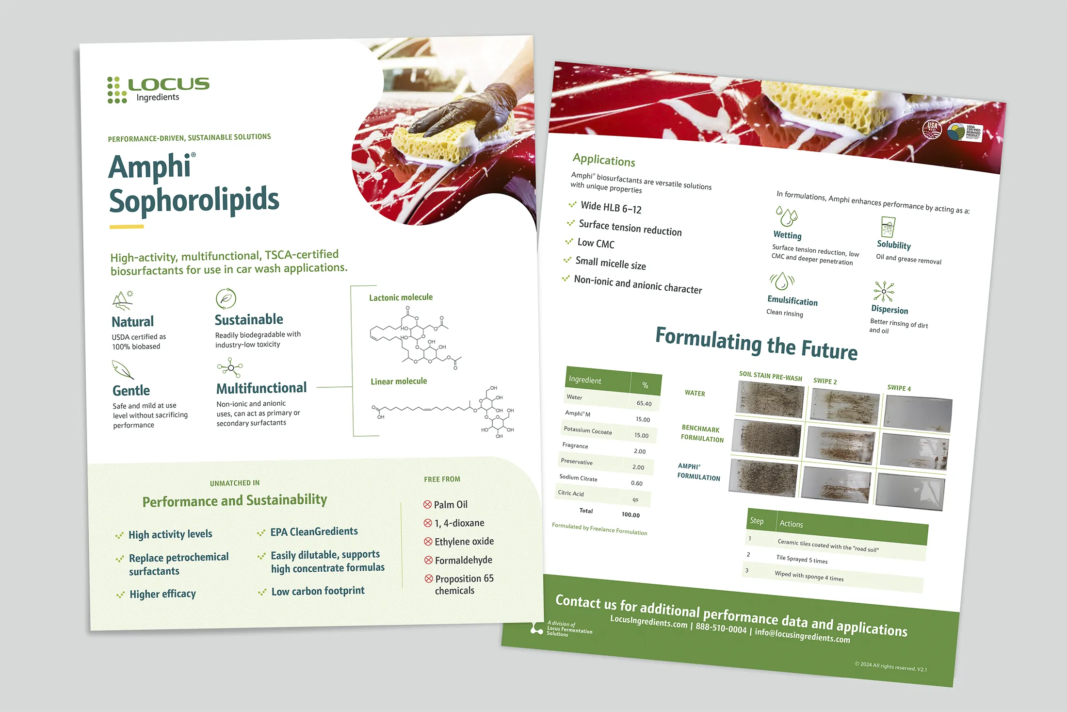
Beyond improving brand consistency, the new system gave the organization a clearer way to communicate its capabilities and provided the creative team with guidelines, templates, and shared resources to maintain that consistency across future work.
The result was a more unified, professional brand presence and a stronger creative operation equipped to support Locus as the company continued to evolve.
The new marketing pieces upped our game and made it easier for my team to connect with customers. Michael and his team really listened to our needs and helped figure out how to best position the Locus brand so my team could close more deals.
Kade Haas
SVP, Locus Agriculture
Credits
Tessa Gilliland
Ryan Kish
Ideal Meca
Michael Ebner