CASE STUDY
Fomenting a Cohesive Identity
CHALLENGELocus Fermentation Solutions (LFS) holds six business units that develop proprietary bio-based technologies for six different industries including energy, agriculture, mining, ingredients, animal nutrition, and consumer products. Due to Locus’s original strategy the business units were all disparately branded, with different visual and verbal identities.
However, with a change in business strategy and company structure the different branding became confusing, both internally and externally, and difficult to maintain.
OBJECTIVEDevelop and apply a new brand system to unify business units across all print and digital platforms, creating a more professional representation of LFS and better consistency and clarity for both employees and customers.
SOLUTIONWe kicked off the process by interviewing colleagues from across the company to understand how the Locus brand was perceived internally, and with customers and vendors to understand how Locus was perceived externally.
Using what we learned in the interview process, we started by redeveloping the LFS logo, followed by the business unit logos, to represent a cohesive family of companies. Then, using the strongest element of the LFS logo, the Locus L, we extrapolated the entire brand system, taking advantage of the dramatic curves which allow for unique, identifiable layouts across all media.
Mission, vision, tagline and values were carefully formulated. Typefaces were specified, color pallets developed, and graphic elements designed.
Organization-wide guidelines were distributed consisting of the completely new verbal and visual identities.
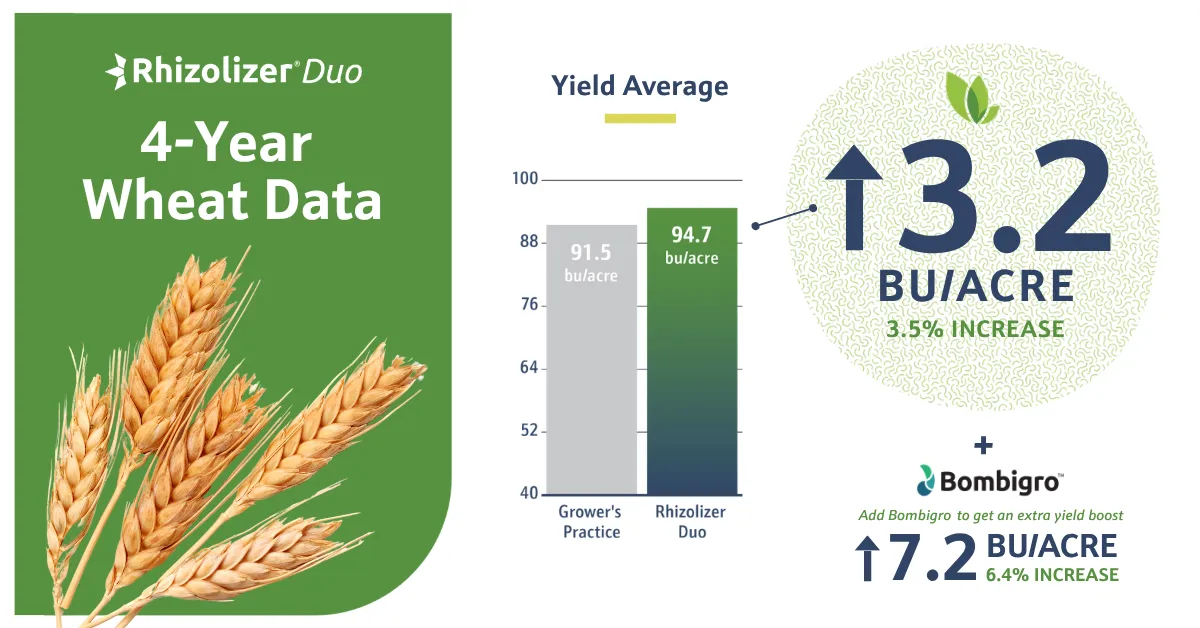
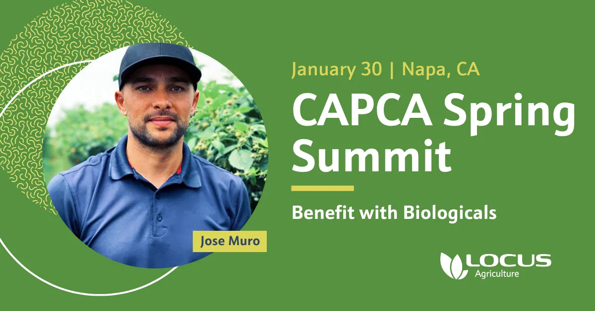
And then we implemented, designing new everything - marketing collateral, social media templates, websites, identity assets, catalogs, presentation templates, email templates. All clear, cohesive and beautiful.
RESULTSThe rebranding effort has positioned Locus Fermentation Solutions as a more cohesive, professional and mature organization, more easily earning customers’ trust and poised for future success across its diverse range of industries. The project addressed the initial challenges, providing clarity for both employees and customers, and establishing a strong foundation for LFS’s continued evolution.
MY ROLEI led the strategic direction of the full rebranding effort and managed a team of three designers through a six-month engagement that extended into a year as implementation expanded across websites, environmental, and additional platforms.
The new marketing pieces upped our game and made it easier for my team to connect with their customers. Michael and his team really listened to our needs and helped figure out how to best position the Locus brand so my team could close more deals.
Kade Haas
SVP, Locus Agriculture
Design Credits
Tessa Gilliland
Ryan Kish
Ideal Meca
Michael Ebner


